Blog
To Mono Or Not To Mono
15/11/15
Black and white images can often affect us in an entirely different way to colour images. It's the same image and the reaction to how we perceive it should be the same, but its often entirely different. Why is that? Read on to find out why I think that is.

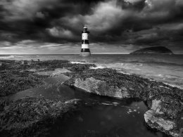
Take this image for example "Dusk at Penmon" taken at Penmon Lighthouse in Anglesey, North Wales.
It was late afternoon in October, and the sun was getting very low behind me. The tide was going out revealing pools of water and seaweed on the rocks, with Puffin Island in the background. A break in the clouds allowed some late afternoon sun to shine through catching some of the foreground and the lighthouse, making them stand out against the backdrop of the sky. This is actually my favourite kind of light because it accents the landscape but doesn't illuminate the clouds. It's a beautiful location and the light was perfect. I used a Nisi Polariser to boost the colours and cut through the pool of water, giving a hint of mystery to what lies under the water. Using a polariser also reduces the shutter speed making the water blur, leaving a trail drawing the eye into the frame.
Now take a look at the Black and White image. It was converted in Nik FX and the contrast boosted a little. It will obviously be different because colour has been removed.

But how does it affect you emotionally compared to the mono? What does it now say to you? I'm not suggesting which is better, just highlighting how it can be different. I often convert an image I think is suitable to mono, and sometimes as an exercise post the colour version and the mono a day later and ask for reactions, and it's always fascinating.
Removing the colour also removes that wonderful golden tone, but it allows the richness of the subtle tones to come through. The lighthouse is more dominant against the subtle greys and the sky is much more dramatic. All images are different, another scene may not have the same drama or the same depth of tone, and indeed some images may be 'high key' with little or no black, mainly light greys.
We don't see the world in black and white, we see colour. When we see a mono image we are drawn to it, the tones, the composition, and we subconsciously get drawn into the world that is the image without the 'distraction' of how we interpret the colour emotionally. There's a sense of wonder to black and white images, and a timelessness to them. I'm not advocating every image should be black and white, I adore our world of colour, but the next time you see an image that is black and white, stop and ask yourself what it is that appeals to you, and would it be the same in colour?
You can find both of these images in the Seascape Gallery and the Black and White Gallery.
Index


