E5 Styling Grids
Download PDF Version
To make sure your site works on mobiles as well as desktops, we make use of styling “grids”. These allow content to be placed next to each other in columns in desktop mode, and then collapse down into a single column in mobile.
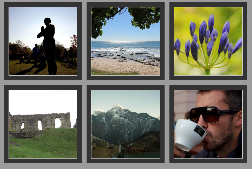
A good example is a gallery page.
In desktop mode the images here are arranged in a 3 column grid.
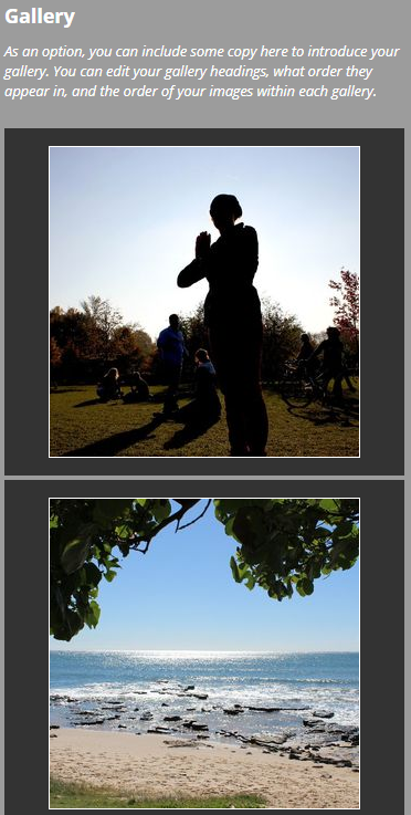
In mobile mode the grid collapses down to a single column.
If your site has multiple columns, they will automatically behave this way, and you can also add your own grids.
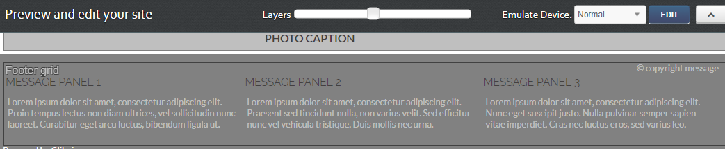
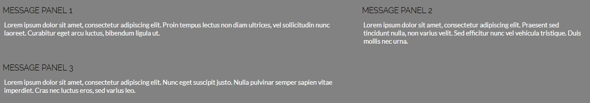
An example grid is the Footer Grid that can be added to your site. Go to Content Other content and select the Options tab. Click Add to site. A grid with three content items has now been added to your site. To remove the footer grid, edit your your site in Preview mode. Use the slider to reveal the grid container. Click it to edit it, and then click Edit other settings. You can't delete it, but you can set untick live or edit it as you like.
Styling grids
Grids can be styled in two ways. The normal way is to expand the columns to fill the available space. This is called “fixed columns”, as the number of columns is always the same.
The second method, which is only really useful for grids with huge numbers of items, such as large galleries, is to specify the width of the columns and fit as many as possible across the page. This is much faster but much less flexible.
When styling your own grids, you will almost always use the “fixed column” mode. By default, grids will show all their “items” in one row, dividing the space equally. To change this, either to place the content onto more than one row, or to adjust the widths to make them unequal, we need to specify a set number of columns.
To do this, use the style editing system to edit a container. In the example show we are going to adjust the the optional footer grid to have 4 items in two columns with different widths. Ensure you are editing the container, and not the items. Use the slider to get at the correct panel, as show in the example.
Then, click the content section to edit it. Expand the “main” settings in the tree and the click on “Container and carousel settings”. You should now see an editing panel like the one below:
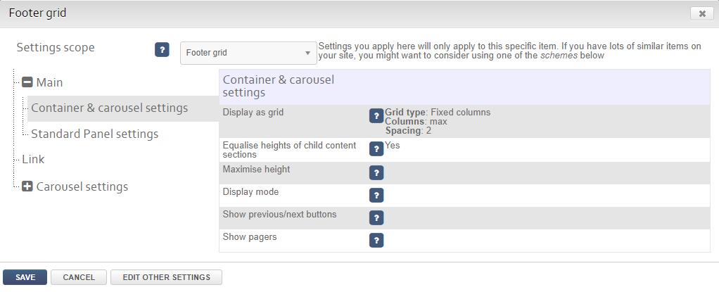
The current grid settings are the defaults for any grid, with “max” for columns and nothing specified for the widths. Click on the settings to edit them:
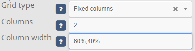
Here we've changed the the number of columns to 2 and added a list of widths, which needs to have the same number of entries and the number of columns. Update the setting and then save your changes.
Adding content to a grid
To add a content item to a grid, first create your content item or edit an existing item.
Then on the edit page, use the position diagram to add your item to the grid. If your grid is not shown, first expand the location where your grid is positioned, e.g. Footer, and then select your grid.
Advanced options
Containers within grids
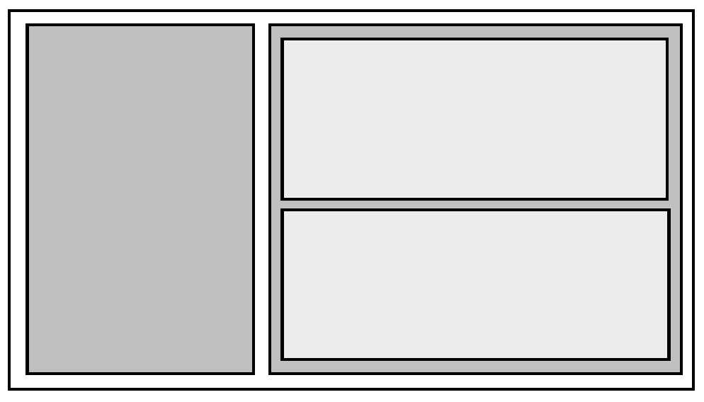
You can put containers or even other grids within grids. This is useful for producing irregular layouts. For instance on your home page if you'd like to have one big item next to two smaller items, you would create a grid to contain the big item and another container which would contain the smaller items, as shown in the example here. If you do this, ensure you create containers for every grid “cell”.
A grid like this can also be set to show three columns in desktop mode, two columns in tablet and one in mobile. To do this, you would set the column number to 1 for the right hand grid in tablet mode.
Different columns for different screen sizes
You will want to turn off most grids for mobile mode. This is the “default” behaviour. You can turn this off by setting "Use grid on mobile devices?" to true.
Carousels and sliders
You can change the display mode of a grid to “Carousel” to creat sliding panels of content.
You can create sliders by creating a a grid with one column and one row. Place other container content sections into it and then add miscellaneous content items to these, such as photos or text.
